
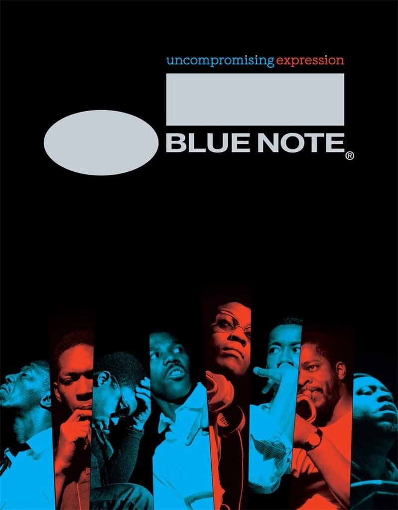
Some record labels have an identity you recognise before you have even read their name. A glimpse of a sleeve, a particular shade of blue, a photograph, a few letters arranged just so, and you know exactly where you are. Blue Note is one of those labels. Its visual identity is so deeply woven into the history of jazz that it has become much more than a record company. It is a visual language, a way of seeing music, and a reminder of what can happen when sound, photography and graphic design come together with a shared purpose.
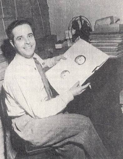
Founded in 1939 by Alfred Lion, a German immigrant with a deep love of jazz, Blue Note began documenting a musical world that was constantly shifting, evolving and finding new ways to express itself. His friend and business partner Francis Wolff joined him in 1940, and together they built a label whose personality would become unmistakable.
But the Blue Note story is about more than great musicians and a catalogue packed with essential records. It is also about the people behind the scenes who understood that music deserved an identity of its own, something capable of communicating its spirit before the needle even touched the groove. At a time when jazz was developing new languages and pushing against established boundaries, Blue Note found a way to make that creative energy visible. And that is where things get interesting, because sometimes a record begins telling its story long before the first note is played.

The ear and the eye
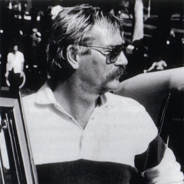
Alfred Lion and Francis Wolff were not simply businessmen looking for something to sell. They were passionate listeners who believed in the music they were putting on record. Lion had an instinctive understanding of the musicians he wanted to work with, while Wolff brought another essential element to the equation: his camera. Trained as a photographer in Germany, Wolff began documenting recording sessions, capturing musicians in those moments when the music was taking shape. These were not polished portraits designed to manufacture a star image. They were glimpses of the creative process itself: a musician leaning forward, eyes closed, lost in a phrase; a trumpet held close to the mouth; a drummer caught somewhere between one beat and the next. Wolff photographed artists such as Thelonious Monk, Art Blakey, Horace Silver and John Coltrane, leaving behind an extraordinary visual archive of jazz in motion.
What makes these photographs so compelling is their intimacy. You are not simply looking at a famous musician; you are being invited into the room, almost close enough to hear the conversation between takes or the scrape of a chair across the studio floor.
There is something important, too, in the way these images portray Black musicians: not as distant figures or decorative characters, but as creative minds at work, individuals shaping a music that would transform the cultural landscape. Wolff gave Blue Note a human face, and that face became an integral part of the label’s identity. The music could be challenging, complex and full of surprises, but the photographs brought you closer to the people making it. They made the whole thing feel real, immediate and human.

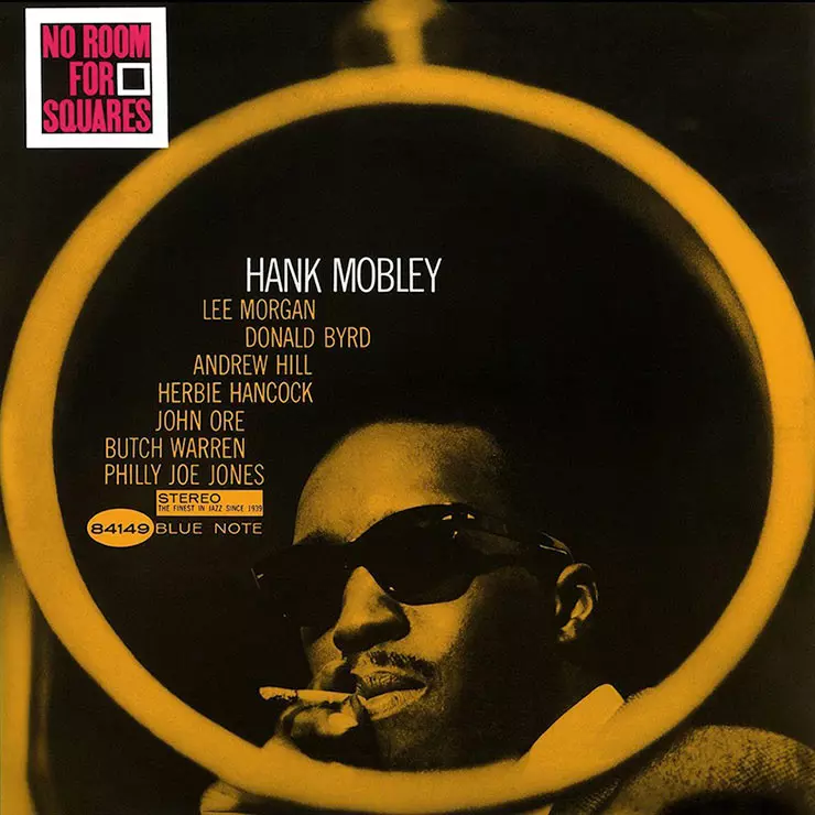
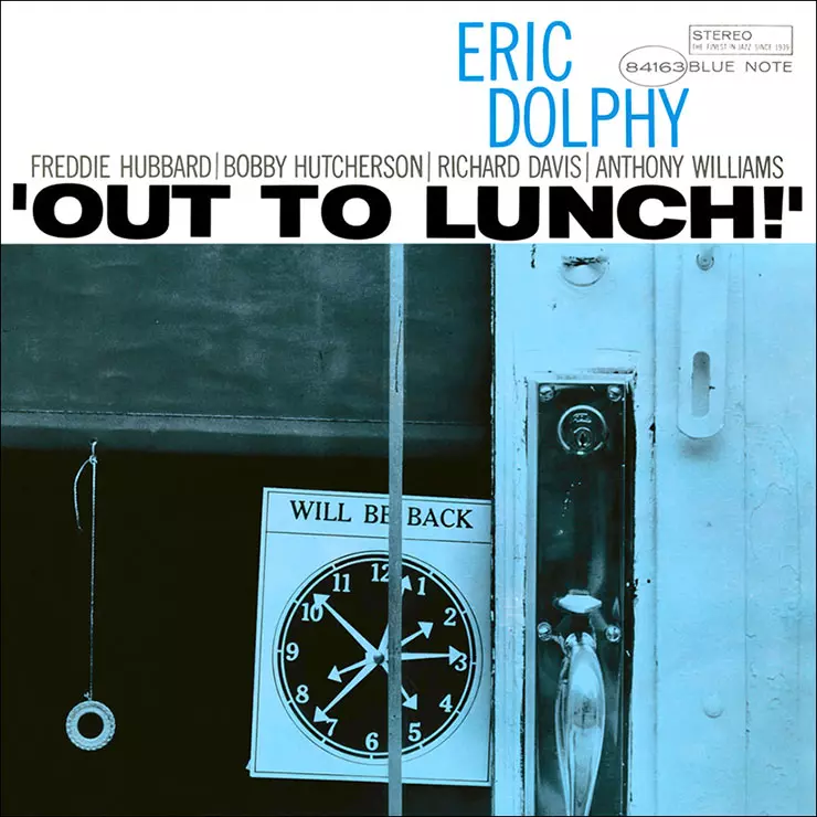
Reid Miles and the art of the sleeve
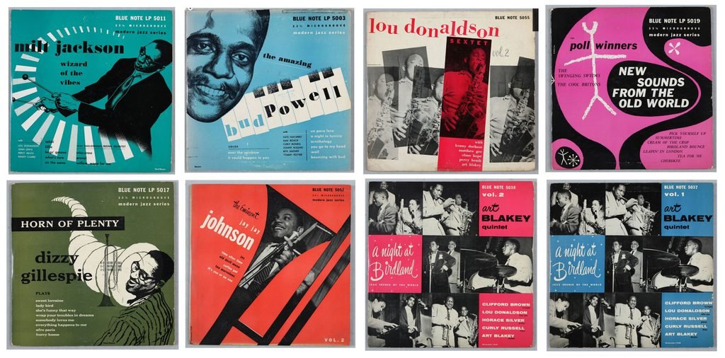
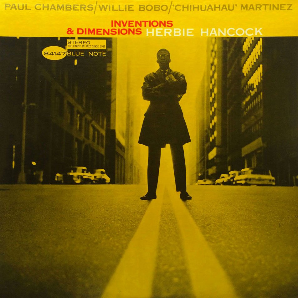
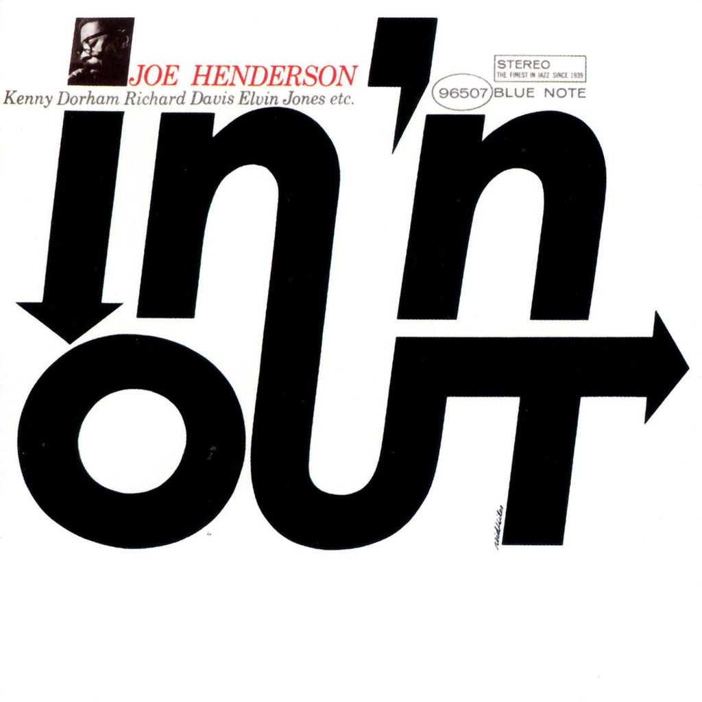
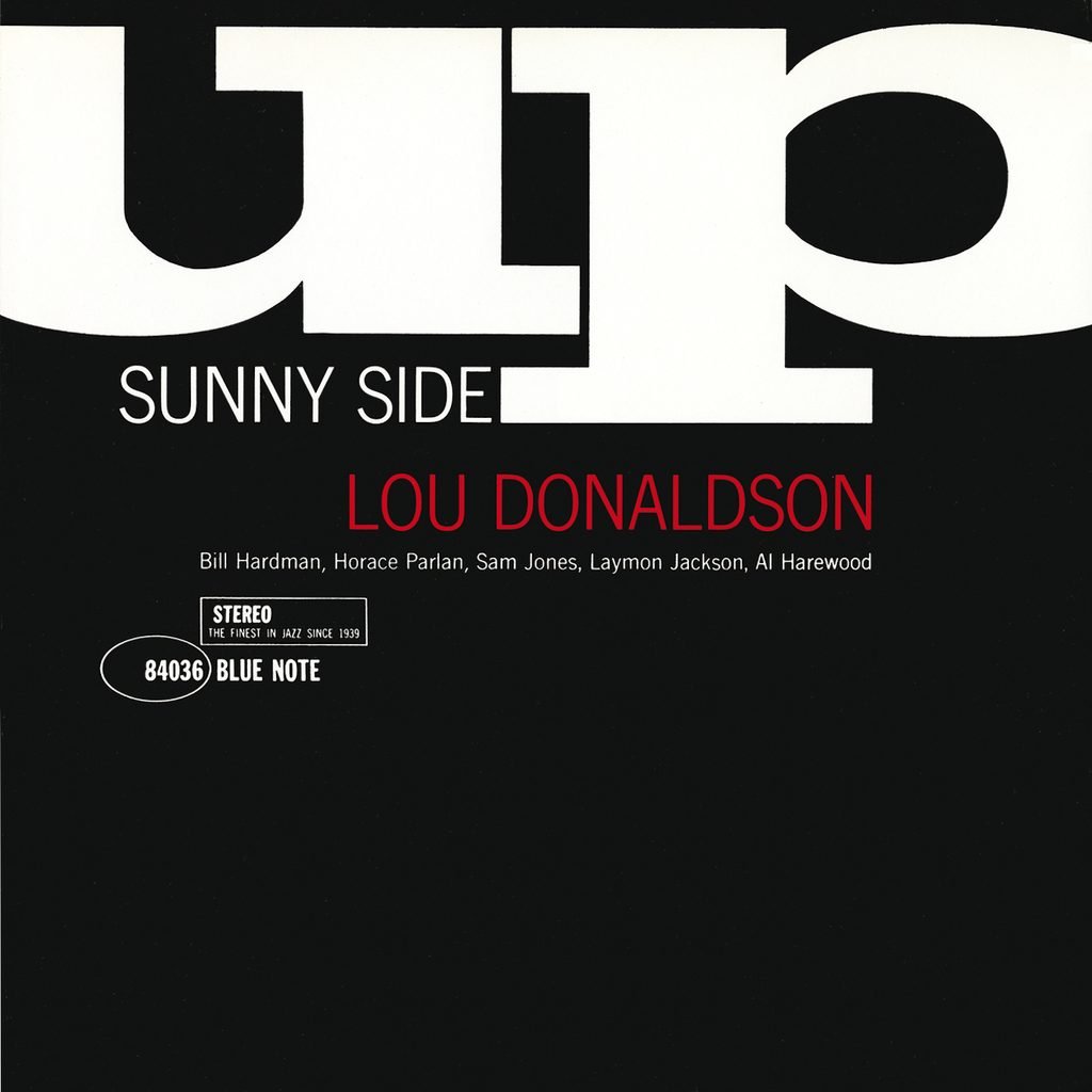
In 1955, graphic designer Reid Miles came on board and helped take the label’s visual identity somewhere entirely new. Miles was not a jazz musician, and he did not need to be. His gift was understanding how typography, photography, colour and empty space could work together to create a visual rhythm of their own. His sleeves were bold without being brash, sophisticated without becoming inaccessible, and modern without losing touch with the music they represented.
He often worked with limited colour palettes, striking photographic crops, off-centre layouts and typography that seemed to move across the sleeve much like a melody moves through a composition. Sometimes the artist’s name took centre stage; sometimes it became part of a larger visual construction. There was no single formula, but there was always a recognisable attitude.
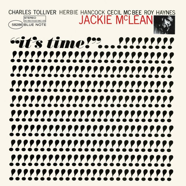
Take Jackie McLean’s It’s Time! from 1964, Joe Henderson’s In ’n Out, released the same year, or the playful visual energy of Lou Donaldson’s Sunny Side Up. Each sleeve has its own character, yet they all belong to the same visual universe. Miles understood that a record sleeve was never just packaging. It was an introduction, an invitation, a small piece of graphic design capable of communicating an album’s attitude before anyone had heard a note. During his time with the label, he designed hundreds of covers, creating a body of work that would influence generations of designers far beyond the world of jazz.
And here is the beauty of it: Miles was not trying to illustrate the music literally. He was searching for a visual equivalent to its energy, tension and freedom. He was, in effect, designing the space around the sound.
He was, in effect, designing the space around the sound.
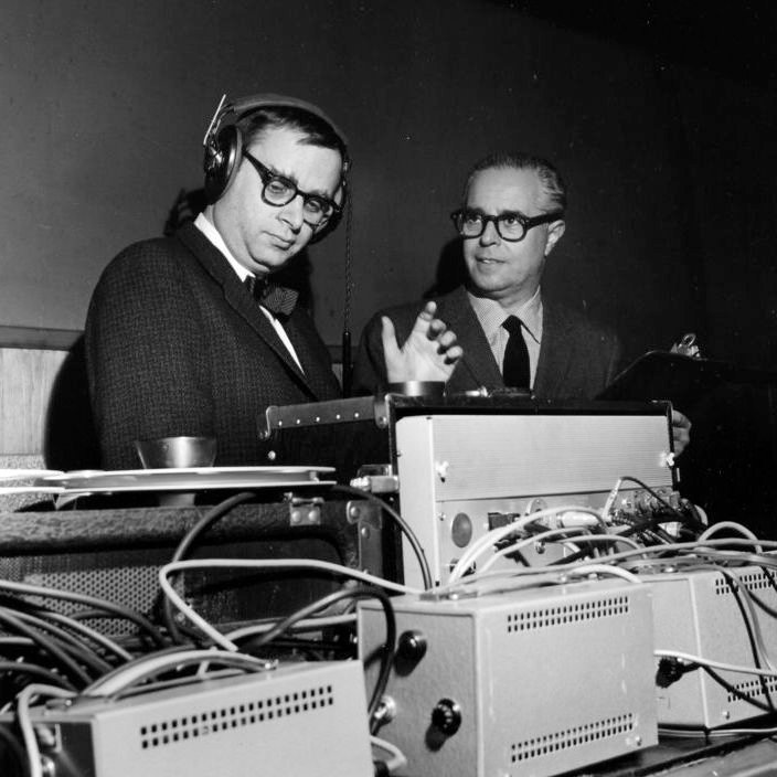
Of course, a beautiful sleeve can only take you so far if the music inside does not deliver. Blue Note’s identity was built on the relationship between what you saw and what you heard, and that brings us to another key figure: Rudy Van Gelder. Working first from his home studio in Hackensack, New Jersey, and later from his purpose-built studio in Englewood Cliffs, Van Gelder developed a recording sound that became closely associated with the label. His approach gave the instruments presence, clarity and weight. The drums sounded sharp and immediate, the bass had body, the piano occupied its own space, and the horns seemed to stand right in front of you. It was a sound perfectly suited to hard bop, capturing the energy of musicians drawing on bebop, blues, gospel and the everyday experiences of Black American life.
Put on John Coltrane’s Blue Train, recorded in 1957, or Lee Morgan’s The Sidewinder, released in 1964, and you begin to understand how these elements fit together. The sound has a physical quality to it; you can almost feel the air moving around the instruments. Wolff’s photographs brought you into the studio, Miles’s designs gave the music a visual identity, and Van Gelder’s recordings placed you right in the middle of the performance.
None of this happened in isolation. It came from different people bringing their own skills, instincts and sensibilities to the same creative process. Blue Note’s achievement was not simply to record great jazz, but to build an environment in which the music, its presentation and its documentation reinforced one another. The sleeve prepared you for the experience. Those first few bars showed you why it mattered.

A legacy beyond jazz
The influence of Blue Note’s visual language has travelled a long way beyond its original setting. Its covers have found their way into design books, exhibitions, galleries and museum collections, including the Museum of Modern Art in New York. Designers continue to study Reid Miles’s use of typography, negative space and photographic composition, while collectors hunt down original pressings not only for the music they contain, but for the physical objects themselves.
This distinction matters, particularly at a time when so much of our musical discovery takes place on a screen. A thumbnail can show you a cover, but it cannot quite reproduce the experience of holding a twelve-inch sleeve in your hands, studying the typography, taking in the texture of a photograph or spotting a detail you somehow missed the first time around.
The original LP format gave Miles room to work. His sleeves became small posters in their own right, objects that could sit on a shelf, lean against a wall or become part of the atmosphere of a room.
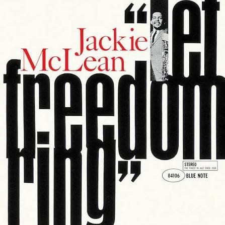
Yet the design was never simply about looking good. It served the music. It sparked curiosity, helped establish an artist’s identity and offered listeners another way into the record. That is why these covers still feel alive today. They belong to a particular moment in jazz history, but their visual language remains strikingly contemporary. They have survived changing fashions, new technologies and the gradual disappearance of physical records from everyday life because they were built on something more substantial than a passing trend. They were created by people who knew their craft and respected the material they were working with. The result is a catalogue in which the artwork is not separate from the music, but inseparable from the way we remember it.
The sleeve might be what catches your eye, but the music is what makes you stay.

More than a record label
Spend enough time around records and you begin to realise that a label can be much more than a name printed on a spine. It can become a meeting point for people, ideas and different ways of seeing the world. Blue Note is a perfect example. Alfred Lion recognised the music he wanted to preserve; Francis Wolff captured the people and moments behind it; Reid Miles gave it a visual language; Rudy Van Gelder helped bring its sound into focus; and the musicians themselves breathed life into the whole thing.
Each brought something different to the table, but the magic lay in the way those contributions came together.
I like to imagine one of those records spinning during a long sobremesa with friends. Someone notices the sleeve, picks it up and starts asking questions. Who designed it? Who took the photograph? Who played that solo? Before long, the conversation has wandered from the artwork to the music, from the music to the musicians, and from the musicians to the places, struggles and experiences that shaped their lives.

That is the beauty of a record: it can open doors you never knew were there. Blue Note did not simply design the image of modern jazz. It helped create a complete cultural experience in which sound, image and human presence became inseparable.
Perhaps that is why those blue-and-white spines still look so good on a shelf. They carry more than a catalogue number or a familiar logo. They hold a moment in time, a way of listening, and the work of people who believed that music deserved to be treated with care. Put one on the turntable, lower the needle and let the room fill with sound. The sleeve might be what catches your eye, but the music is what makes you stay. And if, by the time the record ends, you find yourself looking at that cover a little differently, then Blue Note has worked its magic all over again.
 English
 Spanish